Web application development:
- Custom WordPress websites
- Mobile-first responsive themes, plugins, REST API integrations
- Full-stack high-performance JavaScript web apps
- Standards-compliant HTML5, CSS3, non-obtrusive JavaScript
- SEO-based content
- Optimized for all device types
- Multilingual applications
- Online event ticketing
- e-Commerce
- Sacramento-based
Recent Work
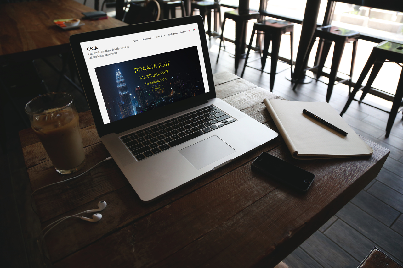
CNIA is a northern California 12-step area organization comprising 1,100 groups with 12-15,000 members.
To support its sizable Spanish membership, Firethorne integrated a language switcher for human-translated content. Every page including all ancillary components such as menus and sidebars are translated in context.
CNIA publishes pdf-formatted English and Spanish versions of their monthly newsletter. We display this content in-page, improving usability by immediately displaying pdf’s, dramatically reducing clicks.
Archived content is neatly tucked away in toggle drop-down lists.
Additional features include an advanced animation slider and contributions portal.
The site is mobile-first and totally responsive. In all ways accessible: for any device, Spanish speakers and members with disabilities.
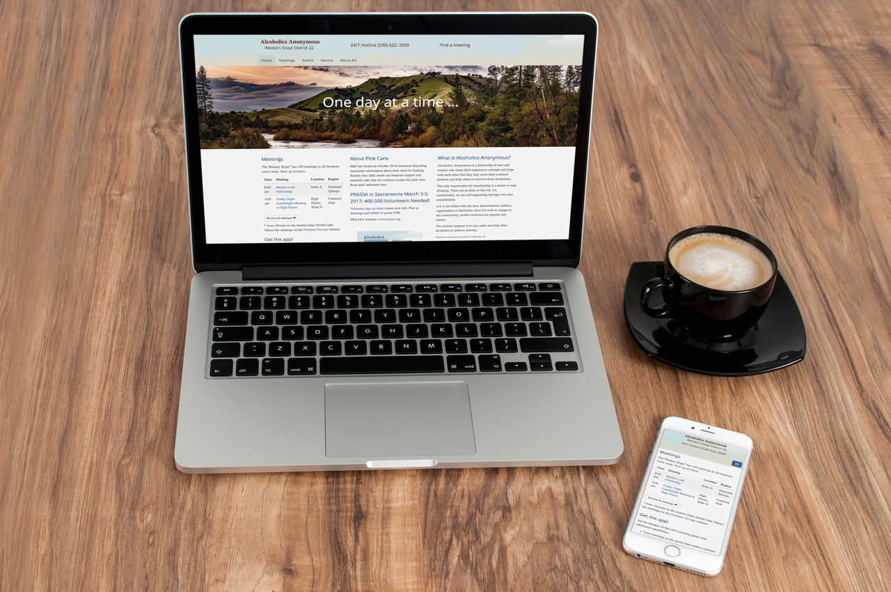
Western Slope District 22 is a fellowship in El Dorado County, CA with 105 meeting in 26 locations each week.
We created a custom mobile-first responsive WordPress theme with comforting pastel colors and imagery of the American River.
Meetings are essential to this fellowship and the primary raison d’être for the site. Meeting schedules are filtered by day, time, location and type; provide directions from the viewer’s geo coordinates and integrates with the Meeting Place mobile app.
Additionally, the home page displays the next 5 meetings in the district at the time the page is viewed.
The hotline is displayed in a sticky header on every screen. Touching the number automatically enters it on mobile phones.
An easily maintained events calendar displays conference, workshop, and social event information.
The site assures members can find meetings and help wherever they are.
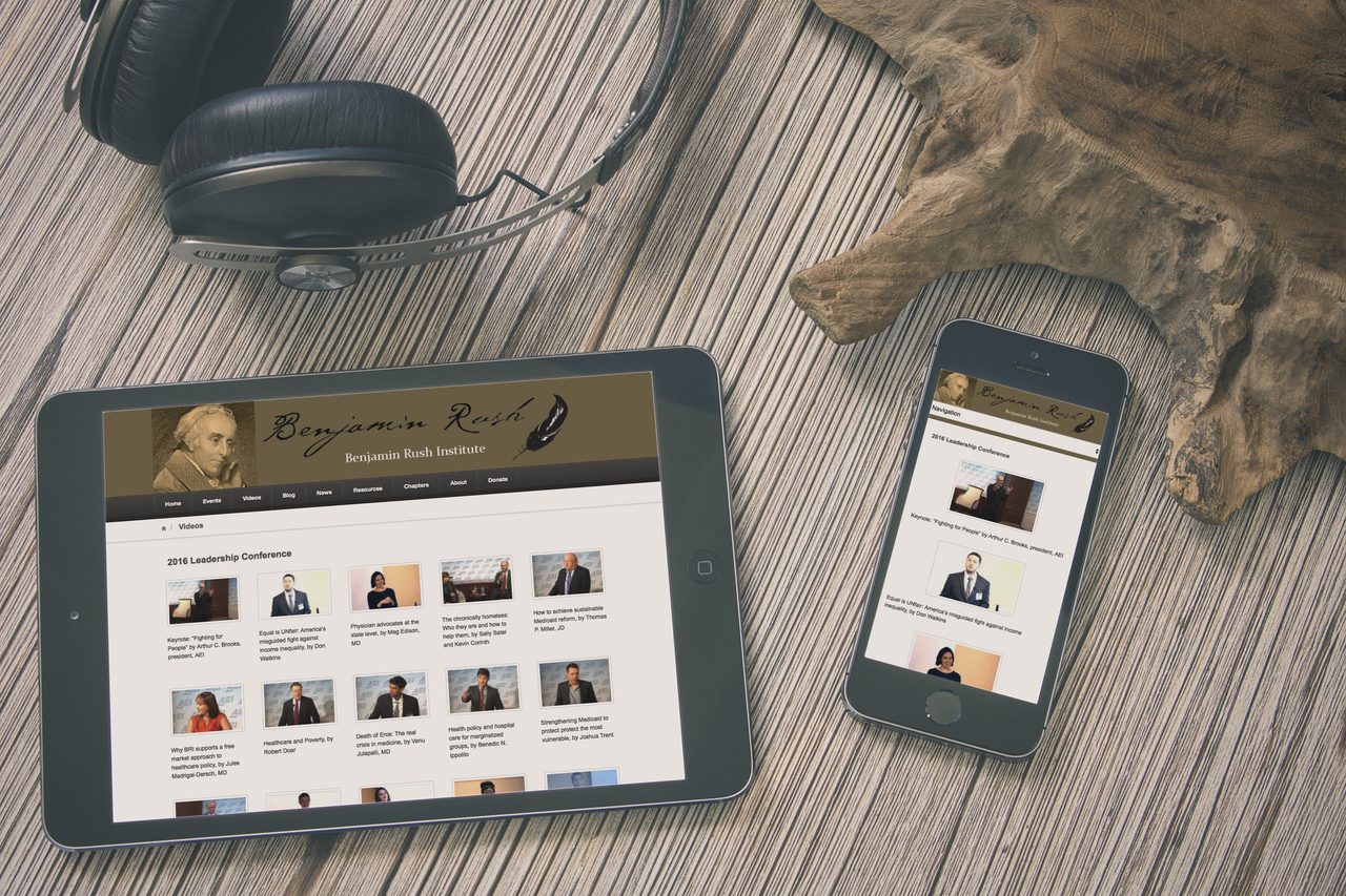
Benjamin Rush Institute is a medical student organization with chapters in the country’s leading medical schools. BRI strives to help students understand and influence increasingly federally-regulated medicine.
Named after the famous Revolutionary War patriot and physician, BRI sponsors talks by prominent physicians, hosts debates and organizes national conferences.
The site is responsive, includes a large video library, social media feeds, news, blogs and a student leader portal.
To accommodate the geographic distribution of chapters, the website serves as virtual headquarters and hub for all institute activities.
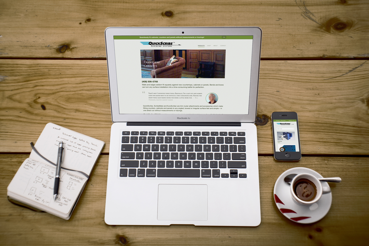
Quick Scribe Systems is an online retailer of professional woodworking tools located in the Sierra foothills.
The store integrates with Woo Commerce, Authorize.net and Paypal gateways.
In addition to sales, the site provides video tutorials and how-to slideshows.
About Us
Firethorne was founded in 2009 by Don Huntley.
Involved in the Internet since joining an online retailer payment processor startup (predating PayPal) in 1994, Don held senior marketing and technology roles at IBM and Disney.
He lived in East Asia for nine years and has a life-long love for Asian language, culture and history.
In addition to development, Don teaches web programming at a Sacramento-area hacking lab and is active in the local WordPress community.
Firethorne Design
P.O. Box 4932
El Dorado Hills, CA 95762
(408) 203–7289